

文章摘要
scbkw
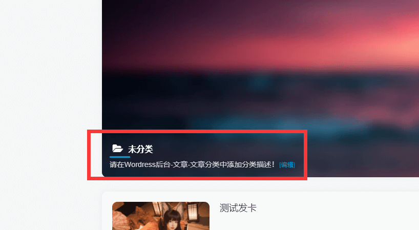
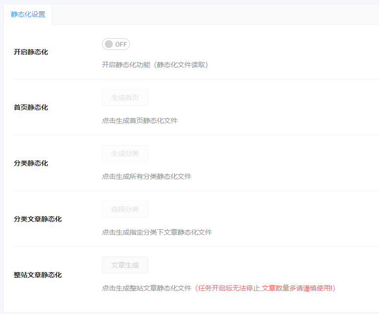
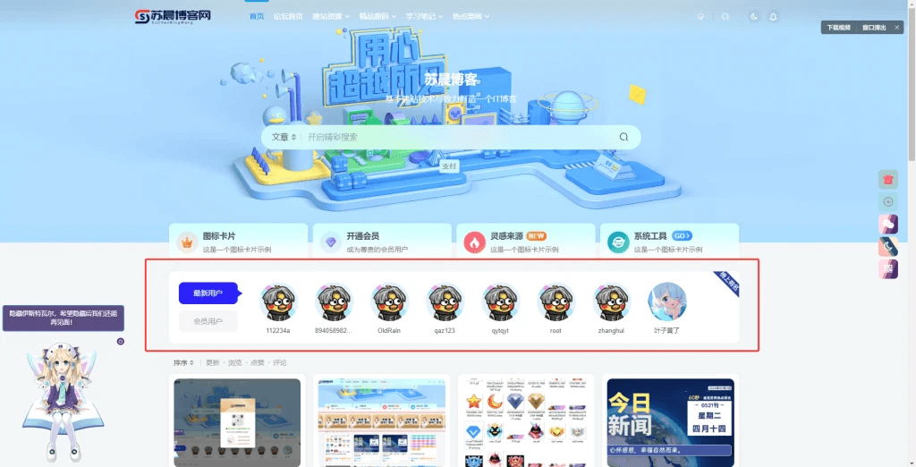
演示效果
![图片[1]-子比添加文章自定义前缀-苏晨博客](https://www.scbkw.com/wp-content/uploads/2024/06/20240625103542354-image.png)
![图片[2]-子比添加文章自定义前缀-苏晨博客](https://www.scbkw.com/wp-content/uploads/2024/06/20240625103548361-image.png)
![图片[3]-子比添加文章自定义前缀-苏晨博客](https://www.scbkw.com/wp-content/uploads/2024/06/20240625103600874-image.png)
代码
css
.DearLicy_prefix{
    position: relative;
    overflow: hidden;
    display: inline-flex;
    align-items: center;
    border-radius: 5px;
    padding: 5px 4px;
    margin-right: 3px;
    height: 19px;
    font-size: 12px;
    top: -3px;
    clip-path: polygon(7% 0, 99% 0, 93% 100%, 0 100%);
}
.DearLicy_prefix:after, .DearLicy_prefix:after {
    position: absolute;
    content: " ";
    display: block;
    left: -100%;
    top: -5px;
    width: 15px;
    height: 145%;
    background-image: linear-gradient(90deg, rgba(255, 255, 255, 0), rgba(255, 255, 255, 0.5), rgba(255, 255, 255, 0));
    animation: sweepTitle 3s ease-in-out infinite;
    transform: rotate(28deg);
}
@keyframes sweepTitle {
    0% {
        left: -100%
    }

    100% {
        left: 100%
    }
}
教程来源于初一小栈
© 版权声明
THE END
![WordPress子比主题美化教程合集[2024/06/30]-苏晨博客](https://www.scbkw.com/wp-content/uploads/2024/06/20240629223236687-image.png)

![Panda子主题-最新版V3.0.7已更新[2025-04-15][更新日志][持续更新中…]-苏晨博客](https://www.scbkw.com/wp-content/uploads/2024/06/20240610154621910267.png)


 酷盾安全提供安全防护和加速服务
- 最新
- 最热
只看作者